WANDER BEAUTY
IN-HOUSE: Digital, Print & Packaging
My role on the in-house creative team for Wander Beauty involved executing briefs for packaging dielines, PR materials, web and email designs, social media content, product mockups, and editing and retouching photo assets. Below are a sampling of these projects.


In addition to the above daily work, in 2019 I presented a case for refreshing the packaging at Wander Beauty to the Creative Director and the CEO. We considered various shortcomings in the former packaging system, what barriers there would be to making this change, and ultimately determined that a change in our packaging was necessary. We spent the year 2020 planning for the refresh and rolled it out across the brand’s catalog in 2021. Below is some of our process.
The Problem:
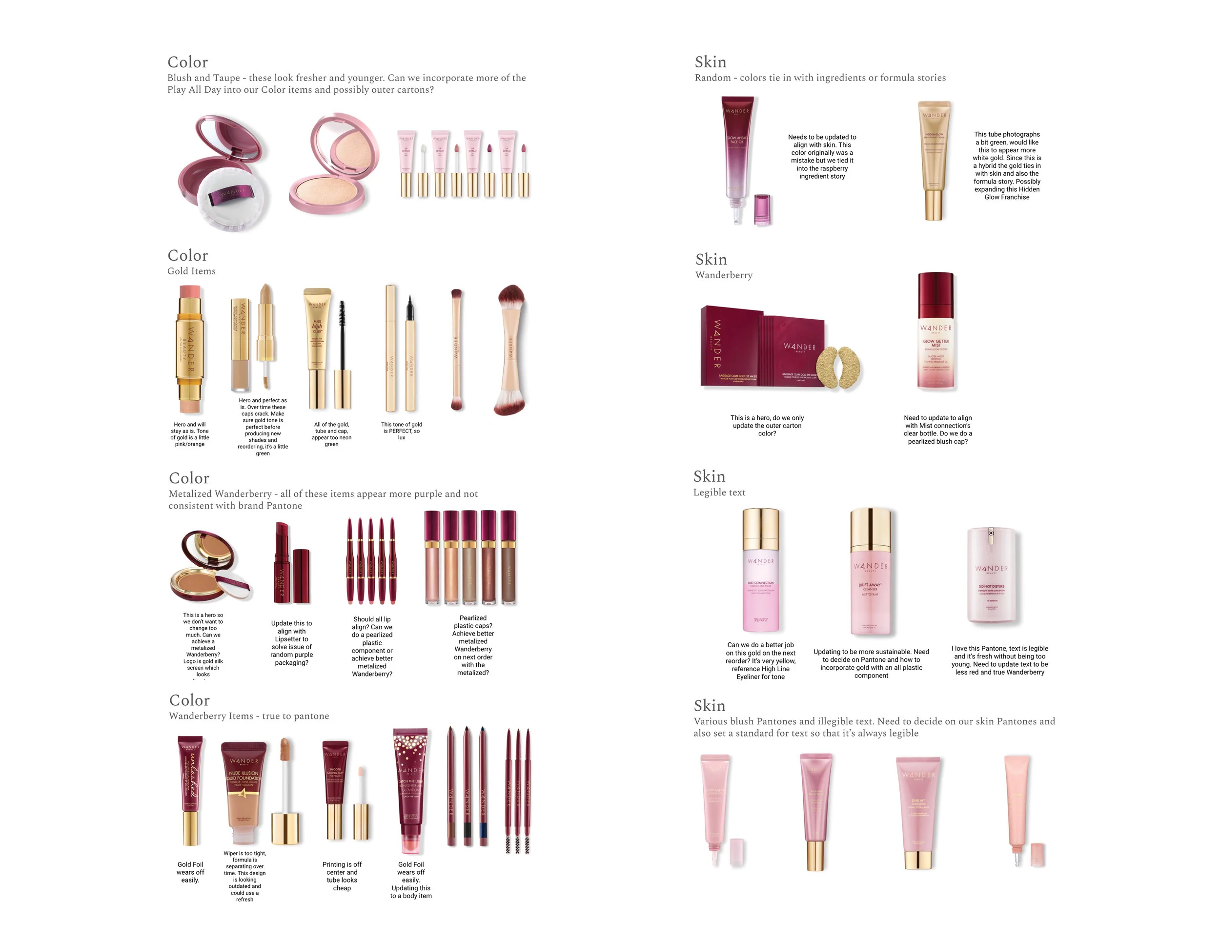
Cartons and components were not recyclable
The former aesthetic skewed older and did not speak to the 25-35 consumer age base
It did not connect to the brand story of Gorgeous on the Go™
Visual was heavy and dark, while the rest of the brand assets are airy and light
Legibility was low due to gold hot stamping
There were too many component colors in use that did not feel intentional or connected to one another
Lastly, there was not enough visual interest in the carton to draw customers in
The PROCESS
1. COMPETITOR RESEARCH:
We visited retailers and competitor’s eCommerce platforms to assess how our competitors had approached their packaging and how that read both online and in store
We specifically looked at brands that recently refreshed their packaging

2. SELF-EVALUATION
We looked at our catalog and the design decisions that had been made in the past that led us to the packaging we were unhappy with
We addressed problem areas in our project management that often led to results we were unhappy with and implemented new project management processes
We developed clear categories for our products so that we could keep this breakdown in consideration as we explore different design concepts
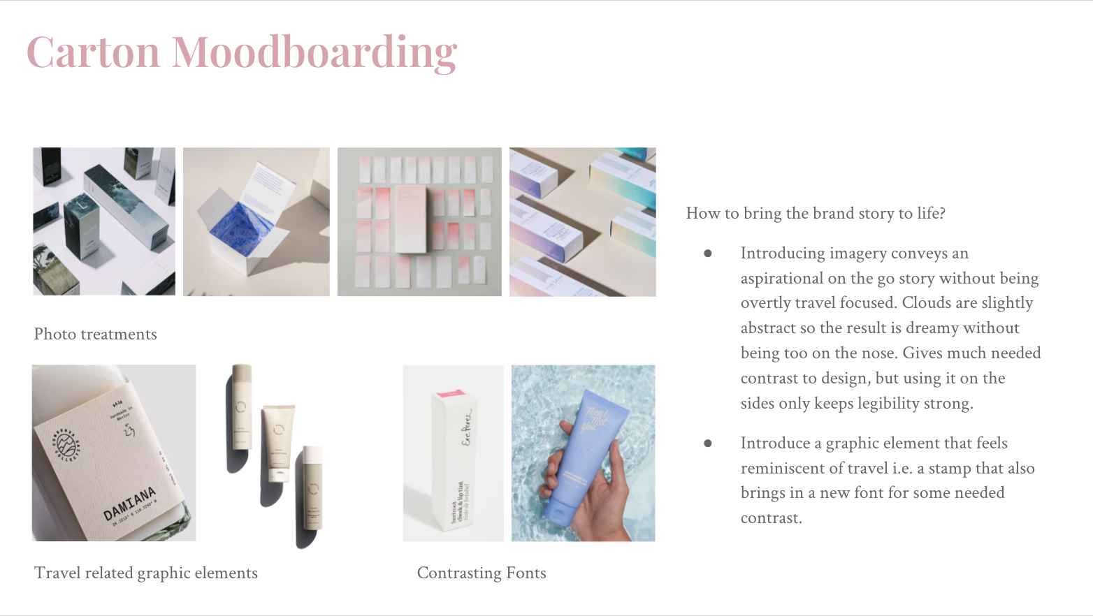
3. CONCEPTING
We developed mood boards with inspiration and design solutions that we felt could help us answer our problems and presented these to our leadership team. We would narrow this down and refine the concepts and represent them until we settled on a couple of options
Once our mood boards were refined, we sketched and iterated on dielines until we found a solution we wanted to test in print
We then took our iterations and tested them in a variety of Pantones and selected our favorites
Finally, we worked with out Product Development teams to source sustainable materials and implement the redesign across our different labs

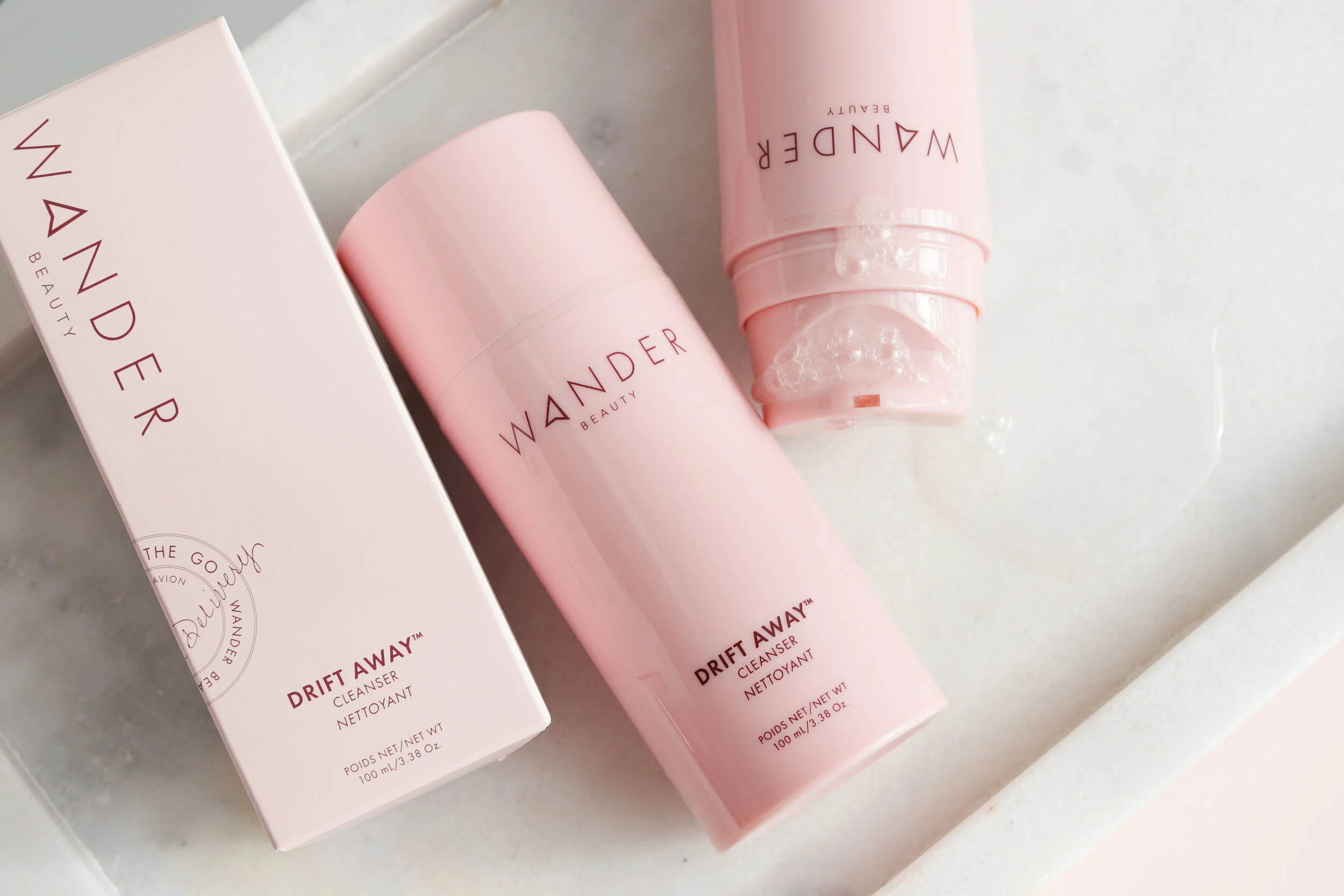
The Outcome:
After our research, self evaluation and iterating we settled on a design direction and set out implementing it. The refresh continued to be carried out on a rolling change as we reordered stock and launch new product.

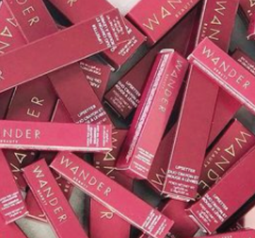
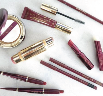
Previous packaging Pantones with no rhyme or reason


New Color Pantones:
L) Complexion Collection, M) Lip & Cheek Collection & R) Eye Collection
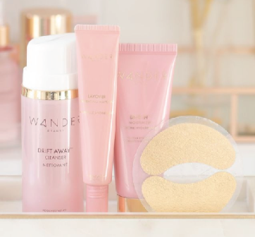
New Skincare Pantones: L) Skincare Core Collection and R) Skincare Treatment Collection